Problem
Many buyers of handmade products often face issues such as confusing, user-unfriendly website interfaces and doubts about the authenticity of the store selling the products. These factors can make the shopping experience uncomfortable and reduce the trust of potential customers.
Solution
To address these issues, the website should have a simple, intuitive design, and provide clear verification of store authenticity through reviews or certifications. This would help build trust and create a smoother shopping experience for customers.
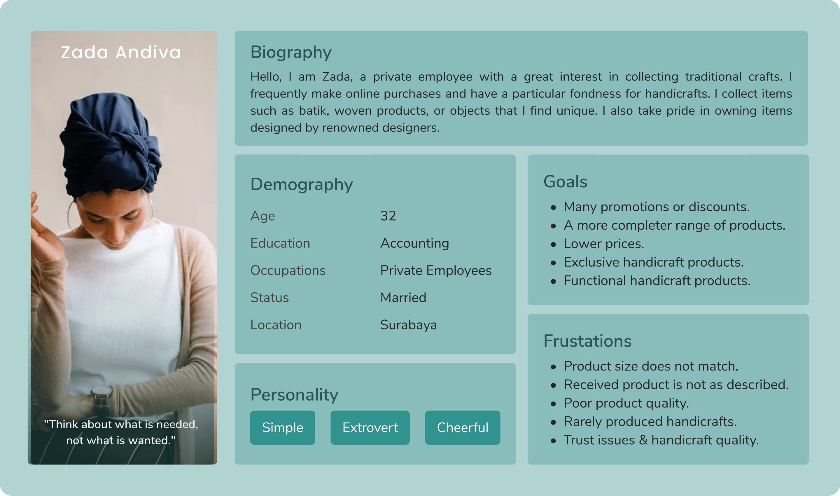
User Persona
User Journey Map

Site Map

Design Process
Design System
I developed a Design System to ensure consistency and usability in the design. With reusable components and a cohesive visual style, the design process becomes more efficient, and the user experience is optimized.

Wireframe
Before jumping into the HiFi design, I create a wireframe to map out the layout and user flow. This helps streamline the HiFi design process and reduces major revisions later on.

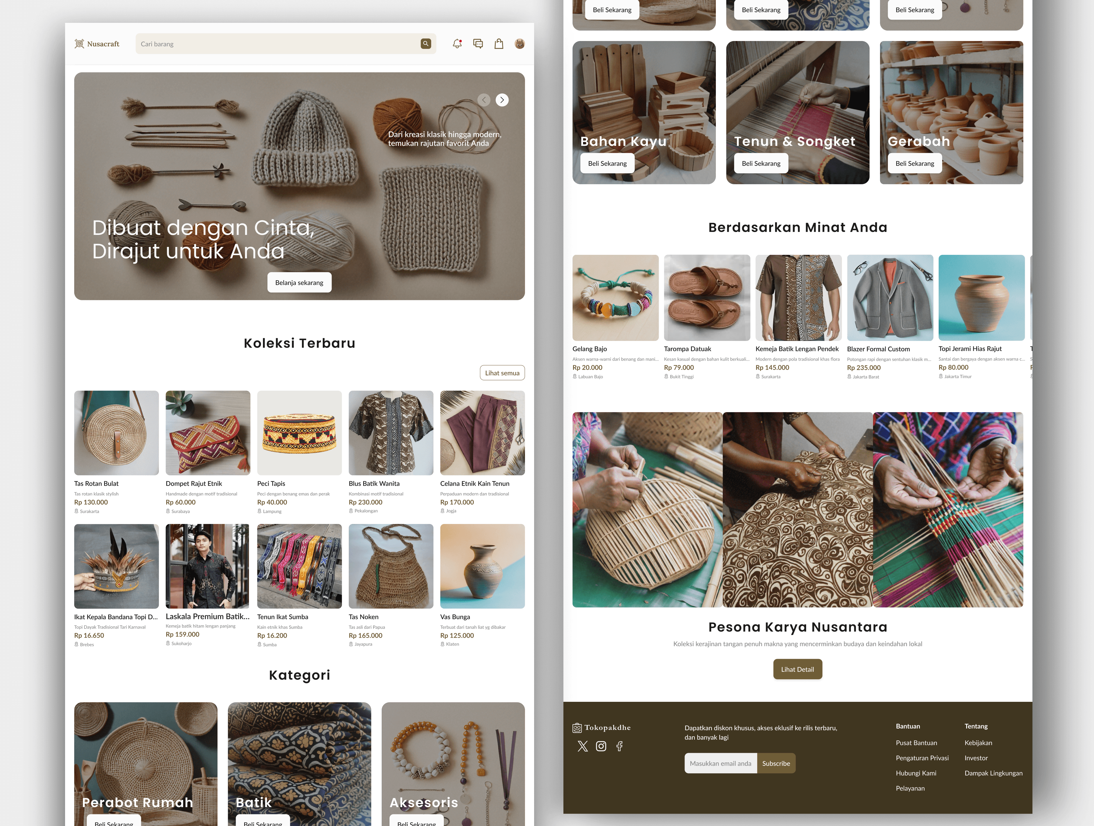
These are some features of the Tokopakdhe website.
Below the store name, there is a badge that serves as a label for official and trusted stores.

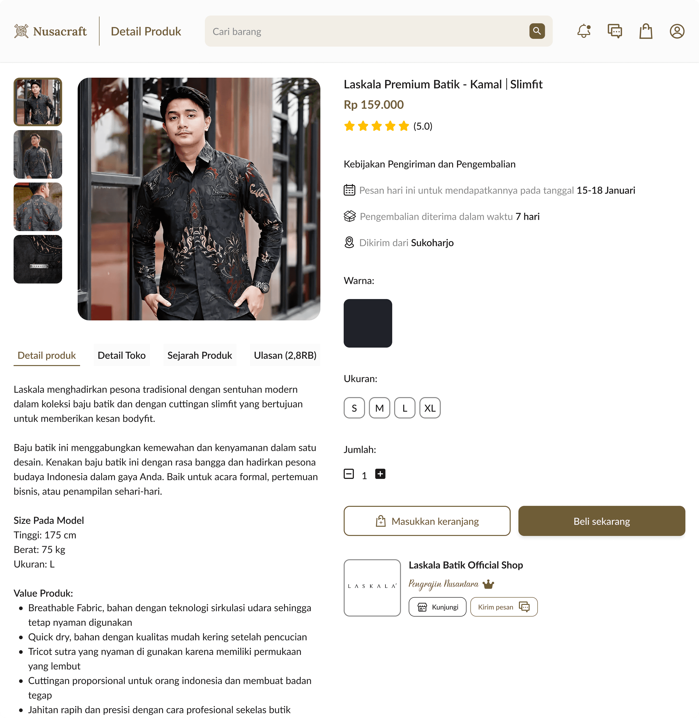
In the Product Details section, there are two parts: on the left is the product information, and on the right is the purchasing process information.
Conclusion
The final design presents a well-organized interface, with clear navigation and strong visual consistency in the use of colors, typography, and icons, making it easier for users to navigate and understand the information presented. However, there are a few suggested improvements, namely:
There is still a lot of empty space on the right side of the Checkout page, especially in the 'Payment Details' section.
Some sections could benefit from a little more white space to make the layout look tidier.
Prototype
If you want to see the prototype click here