Problem
Many office workers struggle to maintain their morning coffee routine due to limited time and long queues during peak hours, making the ordering process inefficient and unpredictable.
Solution
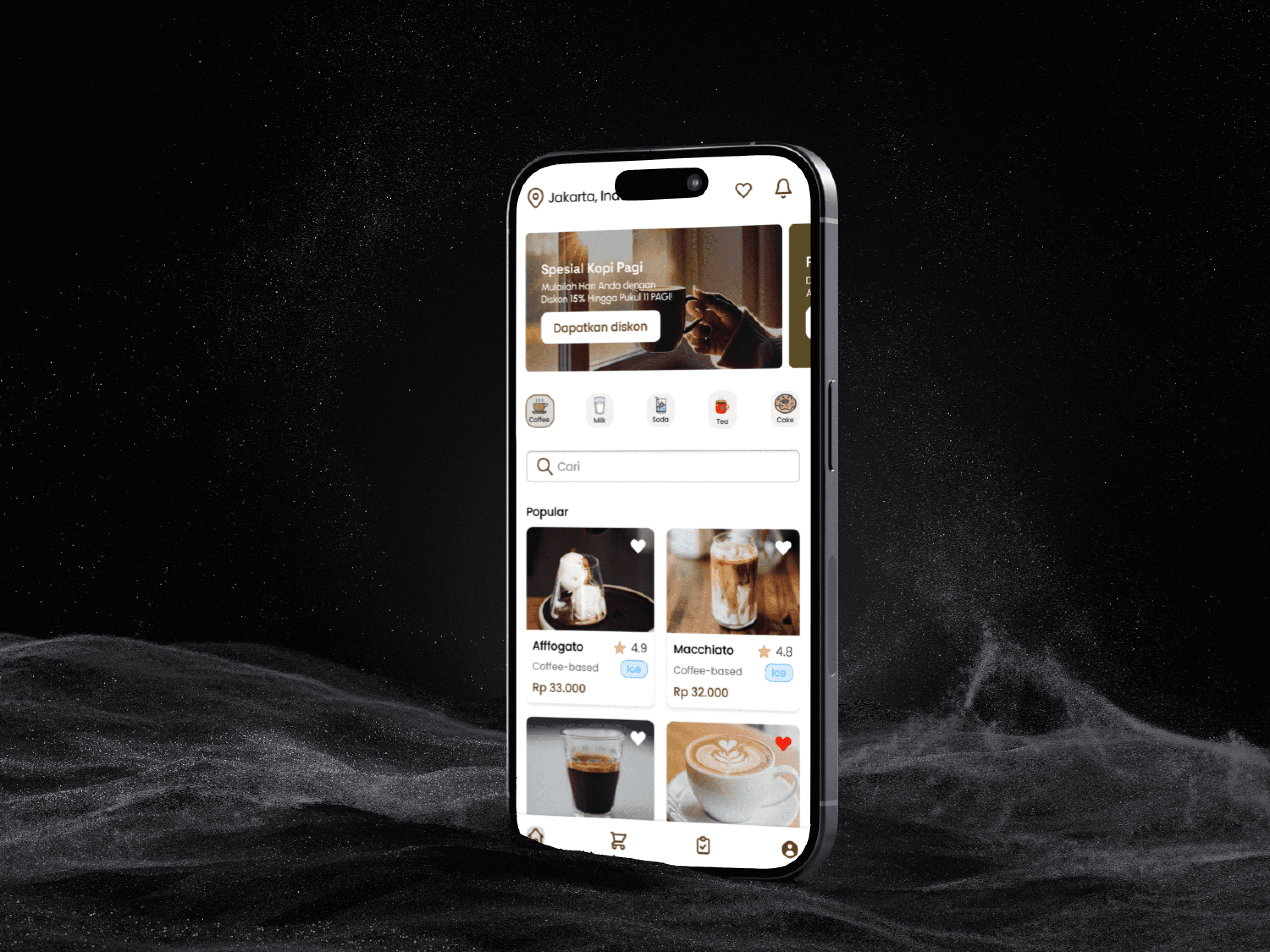
The solution focuses on simplifying the ordering flow through intuitive navigation and familiar UI patterns. A time selection feature allows users to schedule pickup based on their availability, while clear order status indicators help users understand payment requirements and remaining processing time.
Challenge
The challenge in this project is to optimize workflow efficiency without compromising user experience. This includes designing an intuitive interface that simplifies ordering without extra guidance and implementing a pickup time selection feature that lets users schedule their orders conveniently, reducing wait times while keeping the process seamless.
Site Map
User Persona
User Journey Map
Design System
I developed a Design System to ensure consistency and usability in the design. With reusable components and a cohesive visual style, the design process becomes more efficient, and the user experience is optimized.
Wireframe
HiFi
and this is a feature so that users can choose the time to pick up their order:
Usability Testing
In this process, 3 participants interacted directly with the application through Maze and completed predefined tasks.
After completing all the scenarios, the users will then provide an overall rating of the application using the Opinion Scale. The image below shows the results of the Opinion Scale, with an average rating of 4.7.
After receiving the rating scale for this application, the next step is the Open Question, where users can provide comments, suggestions, and feedback regarding the process they have gone through.
Then, I gave the users the freedom to explore the prototype in Figma in-depth so that they could provide detailed feedback on each page or feature. During this process, I invited them to a Zoom meeting and observed them as they navigated through the application.
After that, I received in-depth feedback from them, as follows:
Key Insight
The main issue identified with the Ngopilah app is as follows:
Users need onboarding to understand the app’s key features.
They also need features that can increase their engagement with the app, such as promotions, vouchers, bookmarks, or even notifications, allowing them to receive real-time information.
Design Iteration
And the addition of three onboarding pages
Conclusion
The usability testing validated that the core ordering flow was effective, while also highlighting opportunities for improvement in user onboarding and engagement. Through iterative design based on user feedback, the final solution balances efficiency and clarity, providing a smoother ordering experience for busy office workers.
Prototype
If you want to see the prototype click here


