Problem
Even though digital wallet apps are widely used today many users still find the flow and interface confusing. Some common issues include:
• Transaction processes that feel too long especially when sending money or paying via QR.
• Crowded layouts that lack clear visual guidance.
• Navigation that feels inconsistent between features.
Solution
To address these problems I designed each main flow with a simpler and more intuitive structure. Features like sending money topping up and scanning QR codes were arranged to reduce unnecessary steps and help users complete tasks more easily.
I also focused on creating clear button placements consistent visual hierarchy and helpful feedback from the system. The goal was to make the overall experience feel smooth especially for new or casual users of digital payment apps
User Persona
The user persona was created to represent the characteristics, needs, and behaviors of the target users based on assumptions and research, helping to design a relevant and user-centered experience.
User Flow
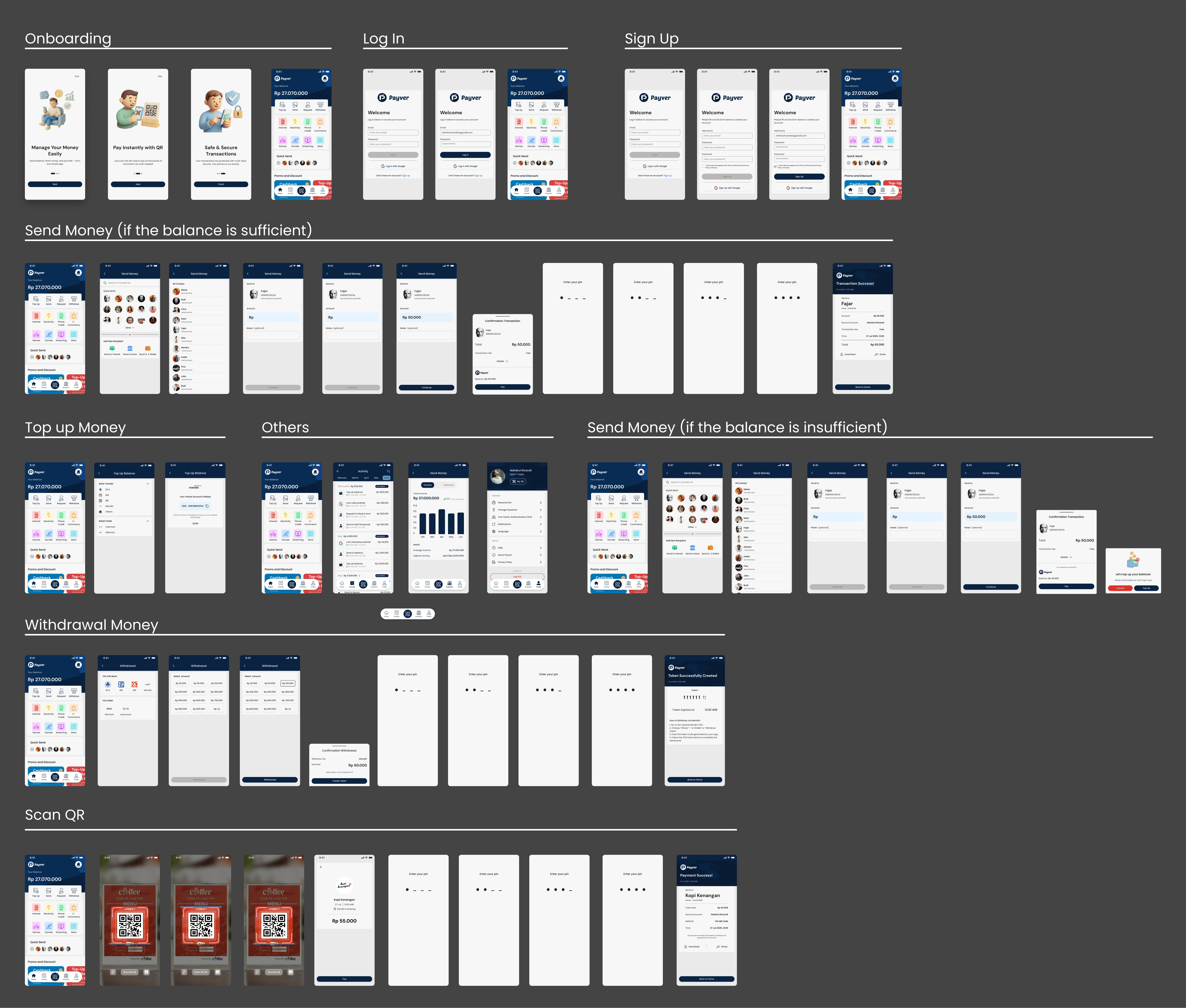
Before jumping into the visuals I mapped out the user flow for sending money to understand each step users would go through. The flow starts from the home screen then continues to recipient selection amount input and confirmation. I also considered possible conditions like insufficient balance and added a clear top up path to handle that case. The goal was to keep everything easy to follow across all scenarios.
Information Architecture
The Information Architecture is arranged to provide a clear structure and smooth navigation throughout the app
Design Process
Design System
I created a small design system to maintain visual consistency throughout the app. This helped keep the layout clean and made the design process more efficient from start to finish.
Wireframe
Wireframes were used to build the layout and structure before finalizing the visual direction. This helped me validate the flow and make sure the screen-to-screen experience felt logical and smooth.
Hi-Fi Design
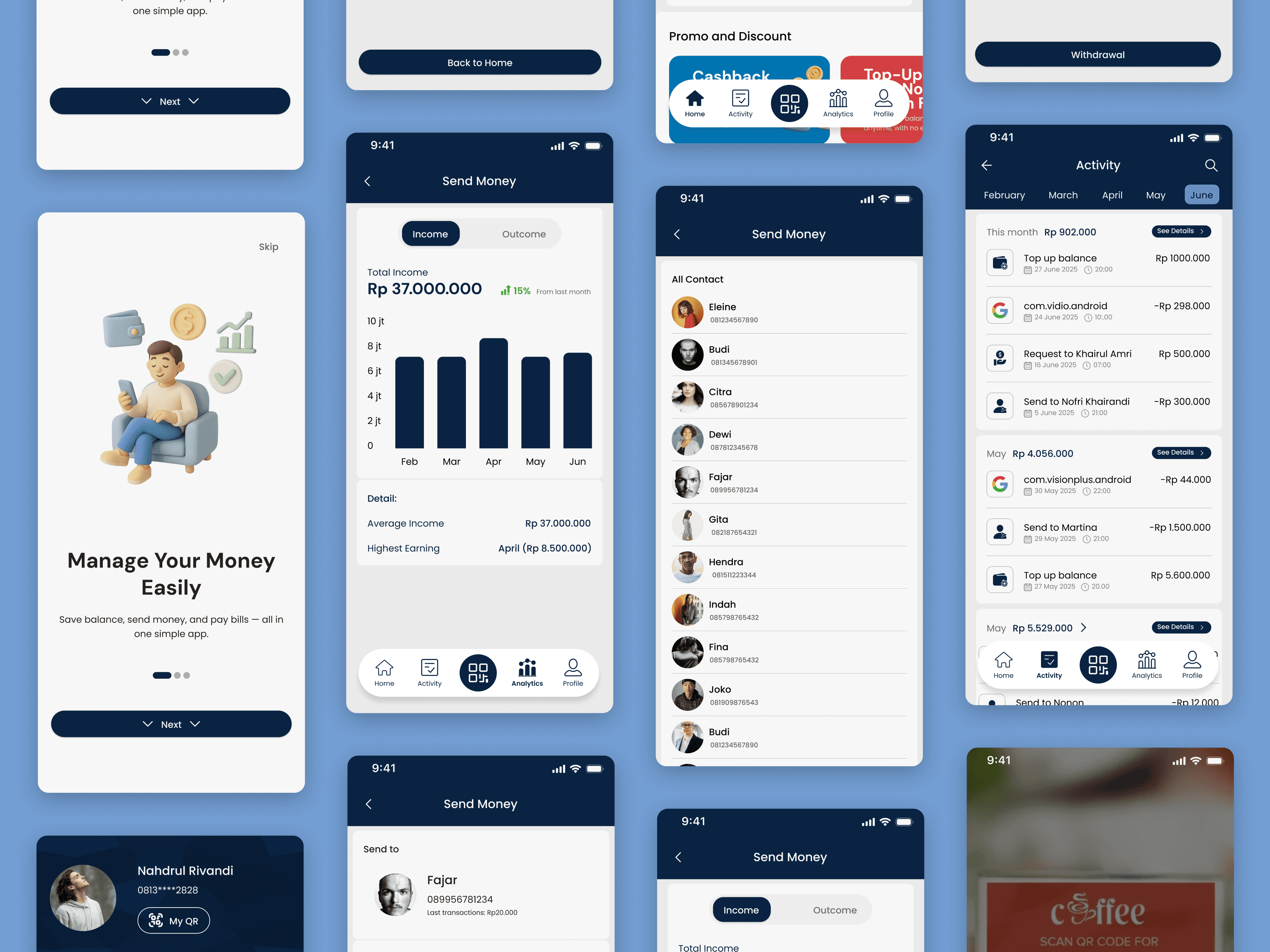
The high fidelity designs show the final interface that reflects the overall visual direction. I focused on making the screens easy to read visually balanced and consistent so that users can quickly understand and use each feature.
Conclusion
This project helped me understand how important it is to design transaction flows that are simple but still give users enough guidance along the way. From solving small issues like handling insufficient balance to keeping each step clear I saw how small design decisions can make a big difference. Even with the challenge of balancing many features the final result feels more unified and easier to use overall.
Prototype
If you want to see the prototype click here
More projects
Lets Connect!
I’m always excited to collaborate on innovative and exciting projects!
Phone


