About KAI
KAI Access is the official application from PT KAI, released to meet the needs of passengers for long-distance, medium-distance, and local/commuter trains. However, due to its outdated appearance and confusing UX, we decided to redesign this website.
Problem
Interesting insights that are the main issues in the current KAI Access website design:
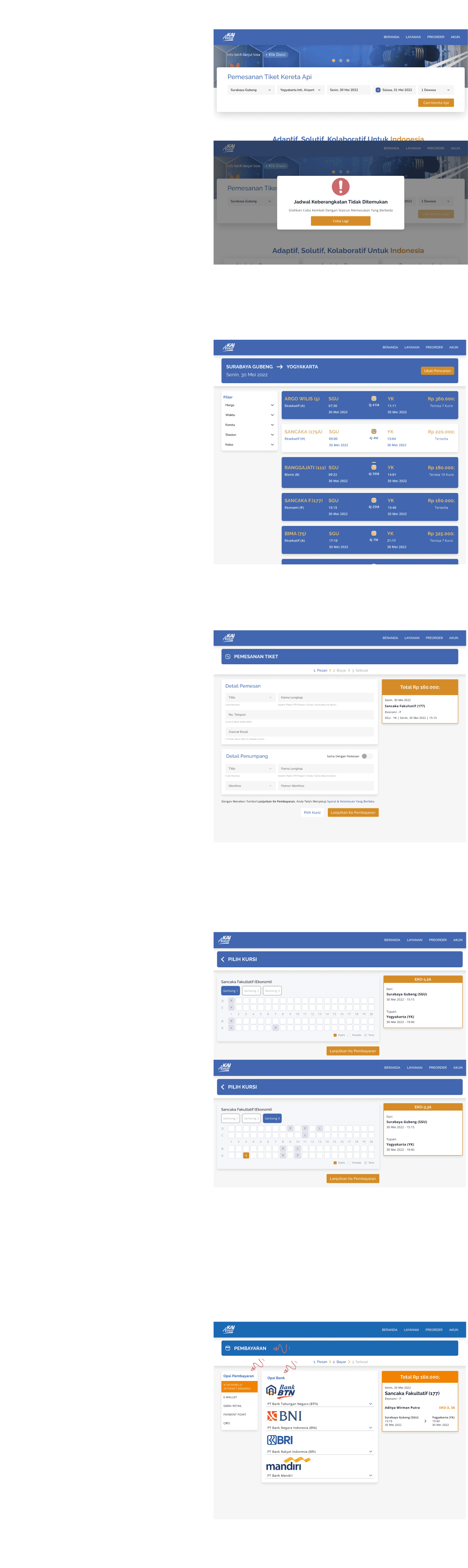
Users have to read the details of each card because the system only sorts by departure time (even if users use filters like price, etc.).
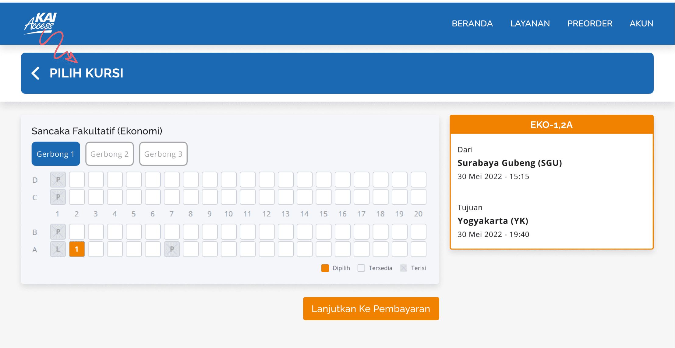
Users directly click on the seat in the carriage because the passenger box does not appear to be a button that needs to be clicked first.
Users take longer to find and understand the function of the checkbox.
Here are the details of the issues on the pages.

Goal
Based on the issues found above, the goal of this redesign is to address these findings so that users can book tickets for their trips comfortably, quickly, and accurately.
Challenge
Designing Filter Features and Train Ticket Cards with Clearer Visual Hierarchy
This challenge is interesting because it requires a creative approach to improve visual clarity and functionality. The constraint lies in designing these elements within the limited screen space without compromising aesthetics.
Enhancing Error Messages and Making Train Carriage and Seat Displays More Informative
This challenge is interesting as it demands a deep understanding of user perspectives to create intuitive error messages. The constraint is ensuring the messages are not overly long but still provide relevant information while maintaining fast page load times
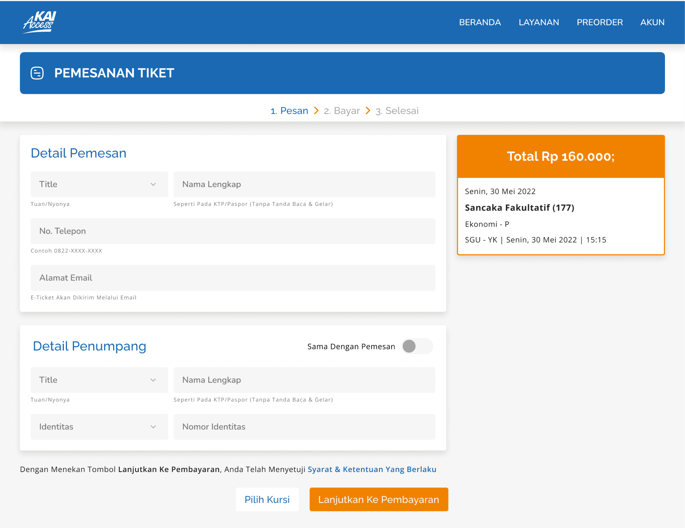
Designing the Passenger Data Entry Flow and Making Checkboxes Easier to Use
This challenge is interesting because it requires attention to the readability and placement of checkboxes to make them more user-friendly. The constraint is ensuring that these changes do not confuse existing users who are familiar with the previous flow.
Solution
Optimizing Search Features and Train Ticket Displays
Making the filter feature more visually appealing and user-friendly
Adding a sort feature to facilitate user scanning
Improving Clarity and Ease of Passenger Seat Selection
Using the user’s perspective to create error messages with more appropriate context
Improving the flow and layout when selecting passenger seats
Refining Passenger Data Entry Flow for a Better User Experience
Changing the checkbox descriptions to be more specific and user-friendly
Placing the checkboxes in the passenger data entry form
Redesign Result
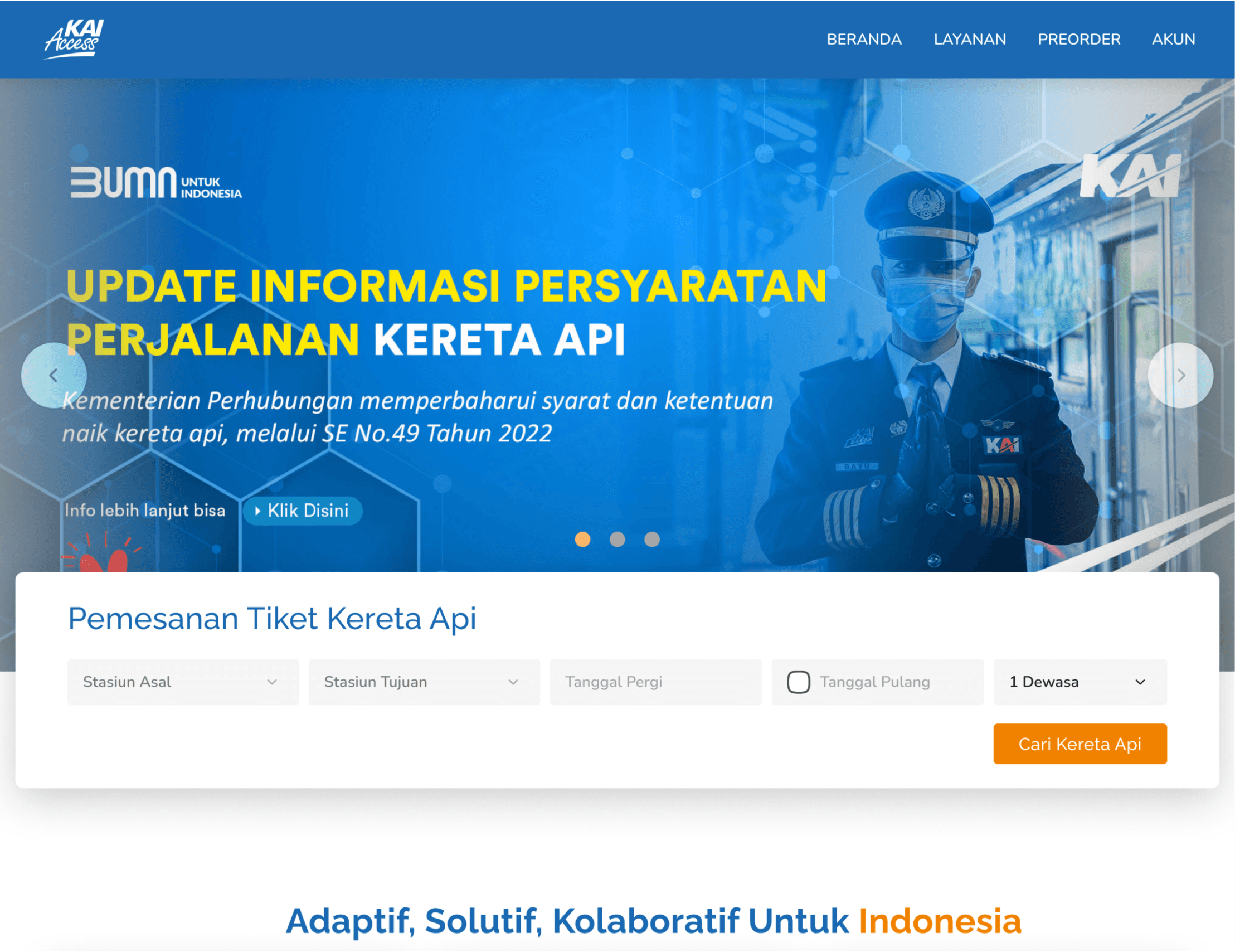
Before
After

Before
After


Before
After
Before
After

Before
After


Usability Testing
We conducted Usability Testing to evaluate and collect user feedback after redesigning the website. I conducted observations and interviews then continued with filling in the overall score of the test scenarios that had been conducted. The image below shows the overall assessment results after redesigning the KAI website.

1 = Very poor
2 = Poor
3 = Average
4 = Good
5 = Excellent
User Feedback
Conclusion
The final result of this redesign shows that there are still some aspects that need improvement. One significant note is that our solution, although intended to provide convenience, has created a new issue—information about the gender of the reserved seats has the potential to be misused. Based on the feedback we received, we realized the need for further iterations. I am looking forward to continuing this process by addressing the problematic areas to produce a redesign that is safer and more user-friendly. Currently, the process is on hold after receiving useful feedback, but it is ready to move forward to the next stage
Prototype
If you want to see the prototype click here
More projects
Lets Connect!
I’m always excited to collaborate on innovative and exciting projects!
Phone