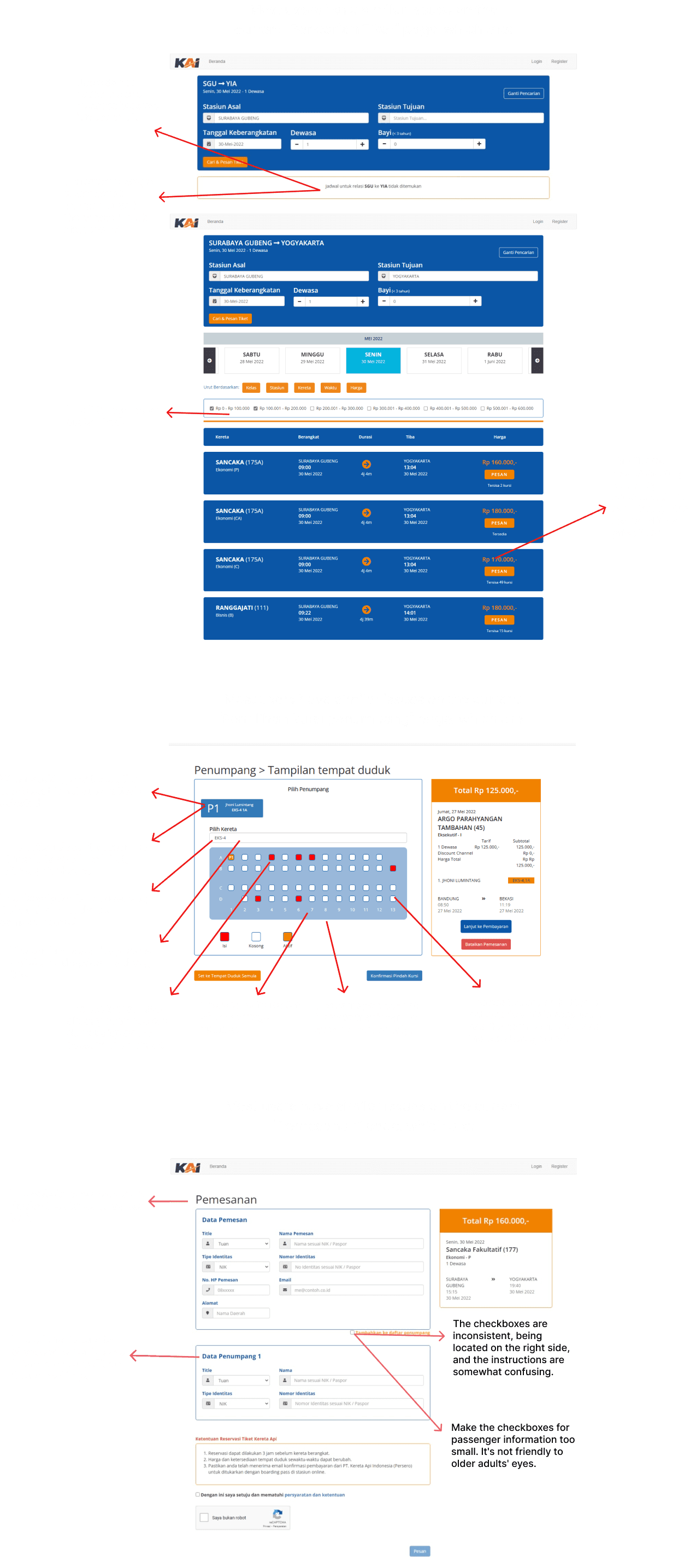
Problem
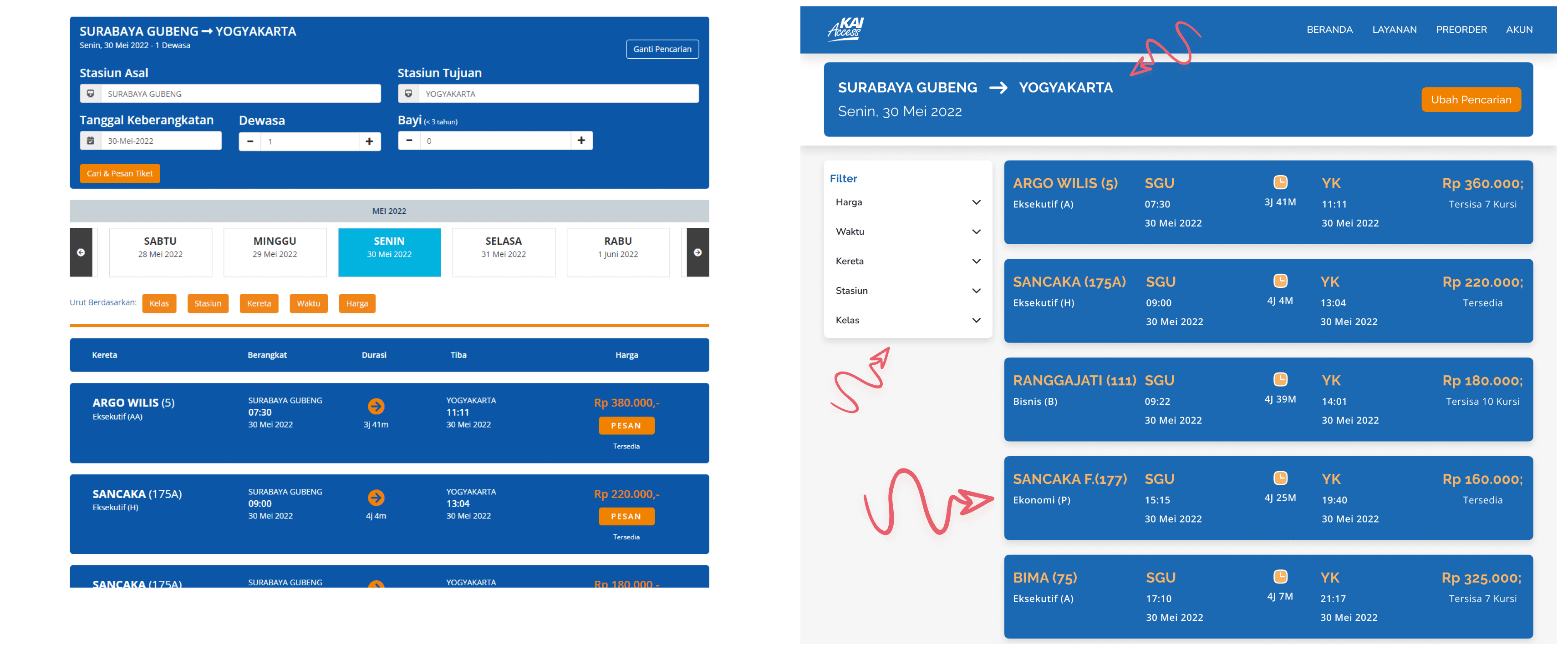
Some key issues with the current KAI Access website design include the lack of intuitive sorting, forcing users to read each card's details since the system only sorts by departure time, even when using filters like price. Additionally, users tend to click directly on the seat in the carriage because the passenger box doesn’t look like a button that needs to be clicked first. Another challenge is that checkboxes are not immediately clear, making users take longer to find and understand their function.
Challenge
The main challenges in redesigning the KAI Access website revolve around improving visual hierarchy in filter features and train ticket displays, making error messages clearer and seat selection more informative, and refining the passenger data entry flow for better usability. The key issue is balancing clarity and functionality within a limited screen space while ensuring any changes don’t confuse existing users
Solution
To address these issues, the design focuses on making the filter feature more visually appealing and adding sorting options for easier scanning. Enhancing error messages with clearer context and improving the seat selection flow helps users navigate more intuitively. Lastly, refining the passenger data entry by adjusting checkbox descriptions and layout ensures a smoother, more user-friendly experience.
Redesign Result
Before
After

Before
After
Before
After

Before
After

Before
After

Usability Testing
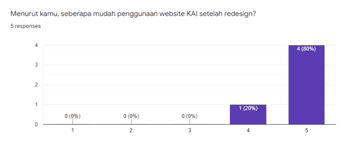
We conducted Usability Testing to evaluate and collect user feedback after redesigning the website. I conducted observations and interviews then continued with filling in the overall score of the test scenarios that had been conducted. The image below shows the overall assessment results after redesigning the KAI website.
User Feedback

Conclusion
The final result of this redesign shows that there are still some aspects that need improvement. One significant note is that our solution, although intended to provide convenience, has created a new issue, information about the gender of the reserved seats has the potential to be misused. Based on the feedback we received, we realized the need for further iterations. I am looking forward to continuing this process by addressing the problematic areas to produce a redesign that is safer and more user-friendly. Currently, the process is on hold after receiving useful feedback, but it is ready to move forward to the next stage
Prototype
If you want to see the prototype click here