
Problem
Modern households are increasingly complex to manage. Couples, families and housemates must coordinate schedules, tasks, groceries, expenses and long term plans, yet these responsibilities are scattered across multiple disconnected tools.
People currently rely on a mix of:
• Calendar apps (e.g. Google Calendar)
• Messaging apps (e.g. Whatsapp)
• Notes apps
• Expense split apps (e.g. Splitwise)
• Grocery lists
• Mental reminders
There is no single place to plan, organise and coordinate everything together.
Goal
Handled aims to become the central platform that helps households plan, organise, and manage everyday life together, bringing schedules, tasks, groceries, and expenses into one connected experience. The goal is to give households a single source of truth for daily planning, improve coordination between members, reduce mental load, and build a platform that scales as their needs grow.
User Persona

Competitor Analysis
Before designing Handled, I looked into how existing household and finance apps solve similar problems, and where they fall short.
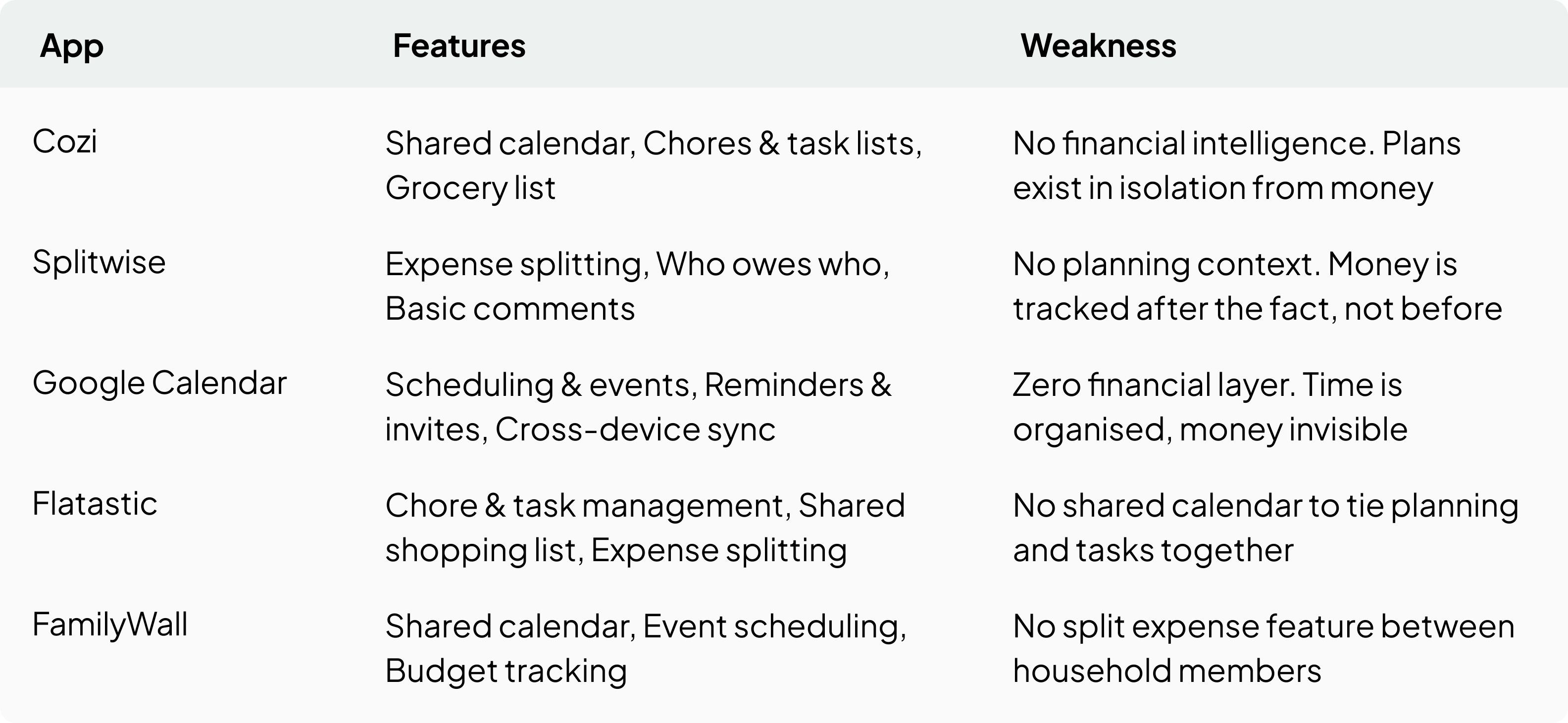
Across every competitor, a different piece was always missing. Some handled planning well but left money disconnected, others managed money but lacked any shared calendar or planning context. Handled was designed to close these gaps, uniting calendar, tasks, groceries, and expenses into one connected household experience.
Scope
Handled was built around five core pillars that together cover the full scope of household coordination, from daily logistics to emotional connection.
Shared Calendar. Keep everyone aligned on schedules and events
Shared Tasks. Assign and track responsibilities together
Shared Groceries. Plan and manage shopping as a household
Shared Money. Track shared expenses and budgeting
Our Space. The identity and memory layer of the household, capturing shared moments, notes, and milestones beyond daily logistics
While the first four pillars focus on the practical side of running a household, Our Space was a pillar specifically requested by the client, intended to give households a shared emotional space beyond daily tasks and planning, something competitor apps typically leave out entirely.
Design Process
Design System
I created a design system to maintain visual consistency throughout the app. This helped keep the layout clean and made the design process more efficient from start to finish. The system was built around two main parts: Style and Component
Style
The style guide defines the typographic scale across mobile, tablet, and desktop, along with the full colour system, neutral tones, semantic colours for status and feedback, and user avatar colours used consistently throughout the app.

Component
Built on a style guide, the component library includes buttons, inputs, dropdowns, navigation, labels, logos, icons, modals, and other components to ensure every interaction in Handled feels consistent and reusable.

Moodboard
Before settling on a visual direction, I gathered references from various apps and platforms to explore different layout styles, colour tones, and interaction patterns. This helped shape the calm and clean visual language that eventually became Handled's design foundation.

Wireframe
Wireframes were used to map out the layout and structure across mobile, tablet, and desktop before finalising the visual direction. Working through each platform early on helped validate the flow and ensure the screen to screen experience stayed logical and consistent across every breakpoint.

Challenge
Handled had no existing logo or defined visual direction when the project began. I proposed an early style direction to align with the client on tone and colour before any screens were designed. This gap became more apparent at the hi-fi stage, when the app needed a proper logo. Despite never having designed a logo before, I created one, which the client responded well to and became part of Handled's visual identity moving forward.
Hi-Fi Design
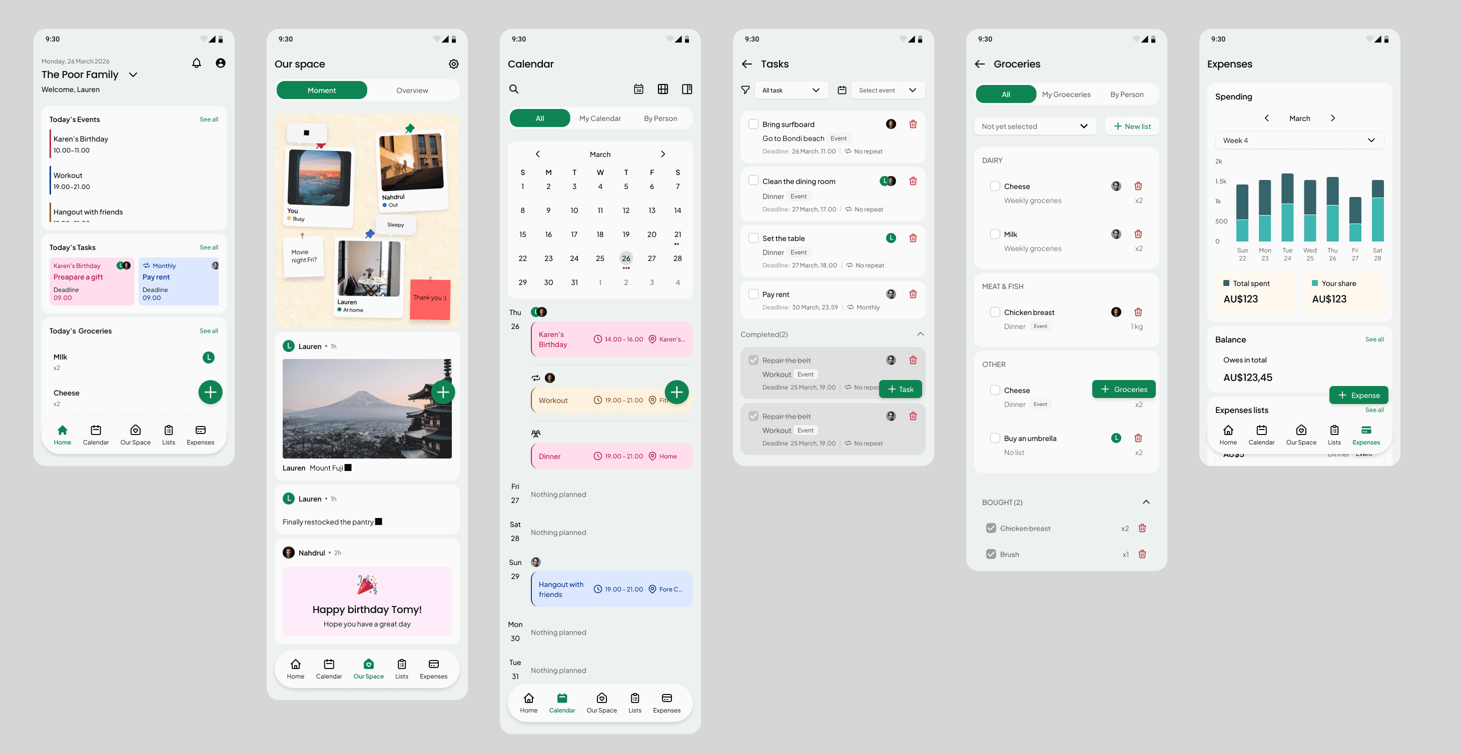
High fidelity designs brought the wireframes to life with the finalised visual style, applied consistently across mobile, tablet, and desktop. This stage focused on refining every detail, from spacing and colour to interaction states, to make sure the final experience felt polished and cohesive across all platforms.
Mobile app
Tablet

Desktop

Developer Handoff
Before handing off to developers, every screen was annotated to document non-obvious behaviours and interaction states, ensuring a clear and consistent reference for the development team.

Result
Throughout the project, I checked in with the client after each milestone, gathering feedback and going through several rounds of iteration to make sure the design stayed aligned with her expectations. After the final meeting, where revisions were made together with the client on the spot, the design was considered complete and ready for development.
The project has since moved into the development phase, and I'm looking forward to seeing Handled come to life once it's ready.

More projects
Lets Connect!
I’m always excited to collaborate on innovative and exciting projects!
Phone